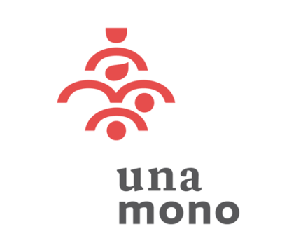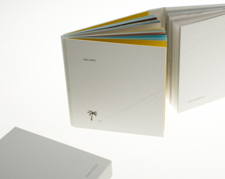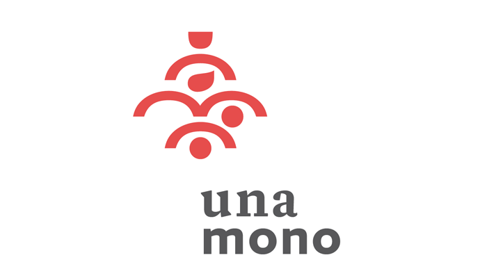
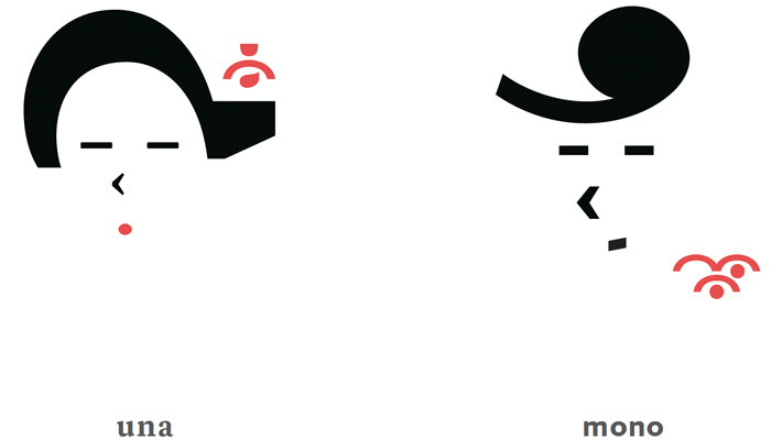
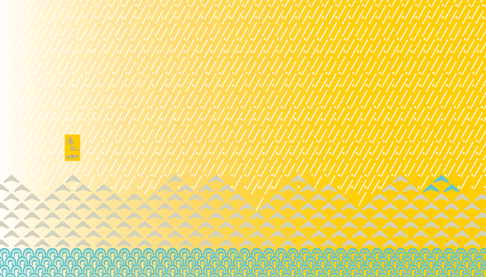

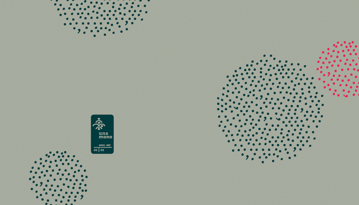
The logo mark consists of solely typographic elements as counters and curved strokes of the brandname unamono. The arrangement of the single elements is inspired by Japanese family crests. The first edition of products tells the story of una’s and mono’s getting to know in Hong Kong, visualised by typographic patterns (landscape) and colours (mood or emotions).
design of:
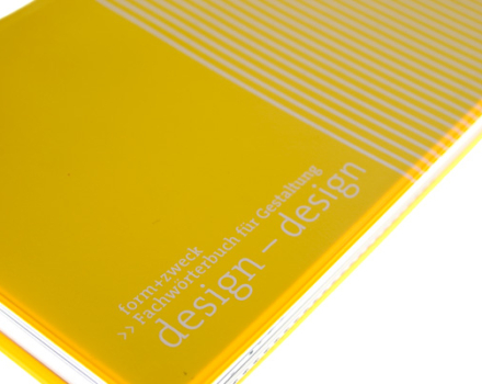
Sign, business card, letterhead paper, icon design (pictographic portraits) and textile/product design.
client: unamono
visit: http://www.unamono.com